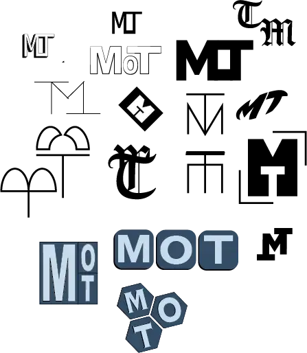
Early Directions
Testing distinct formal directions for the initials, from condensed structures to more modular and playful arrangements.
Identity & Brand System
Identity & Brand System
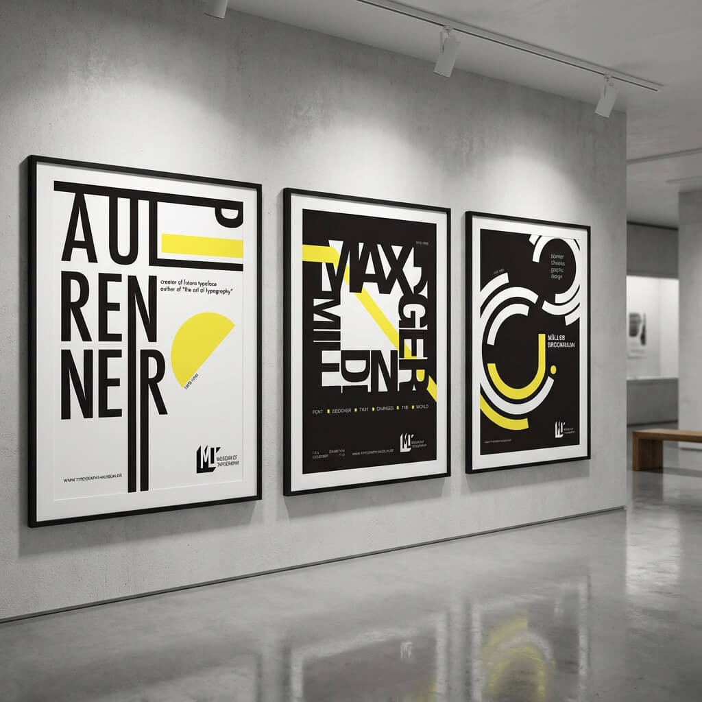
Museum of Typography is a conceptual identity system exploring typography as both content and display. The project asks how a museum identity can behave like a living archive-flexible, modular, and expressive across changing formats and exhibitions.
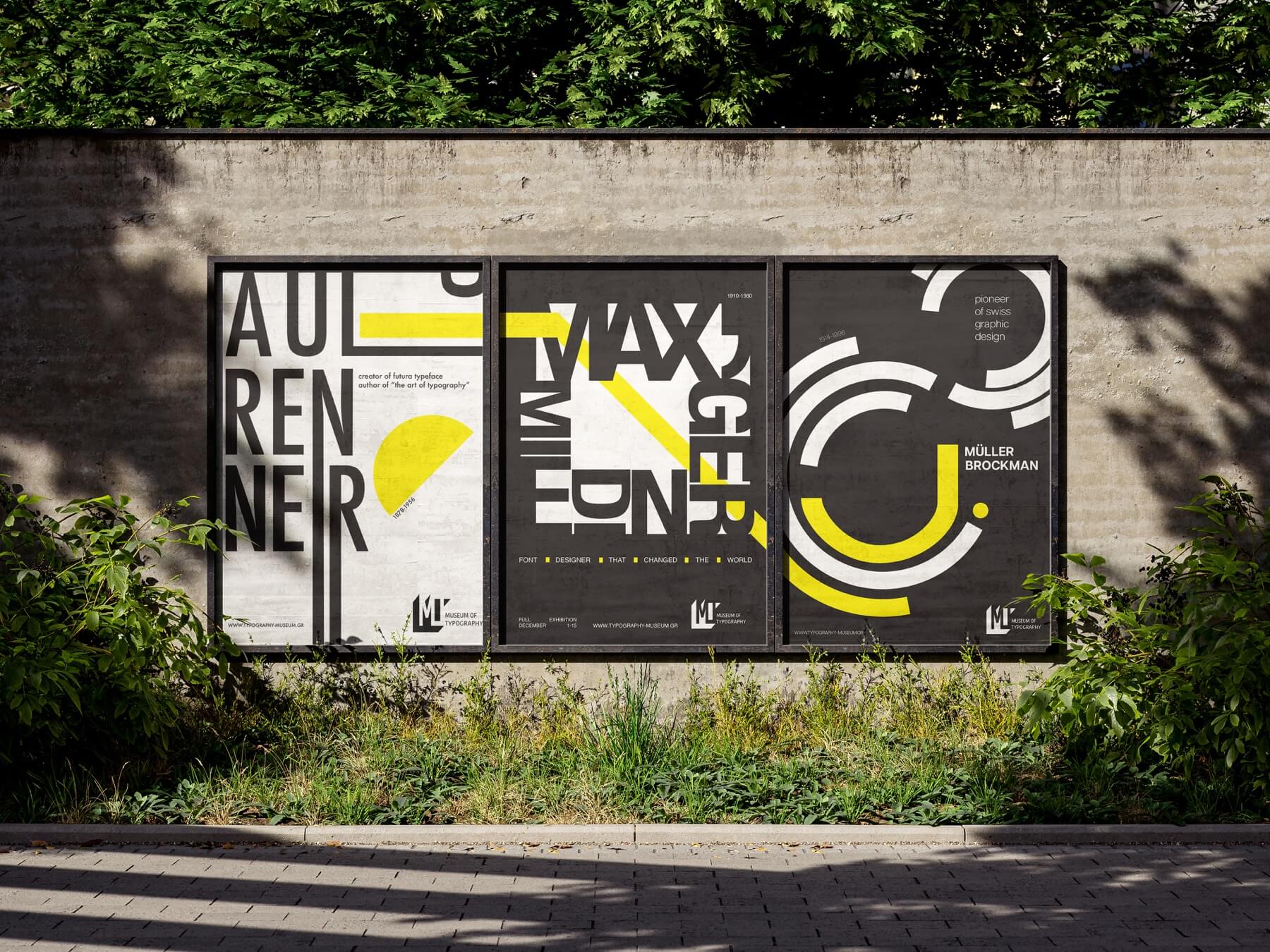
Traditional museum identities often function as static containers. This project rethinks that model by treating typography itself as the exhibition language. The identity is built through modular relationships between scale, hierarchy, repetition, and negative space-allowing the system to shift while remaining coherent.
This is a conceptual project created as part of my design studies.
The identity began through iterative typographic studies around the initials M, O, and T. I explored compression, stacking, repetition, fragmentation, and negative space to test how the mark could function both as a symbol and as a flexible visual language.
Testing distinct formal directions for the initials, from condensed structures to more modular and playful arrangements.
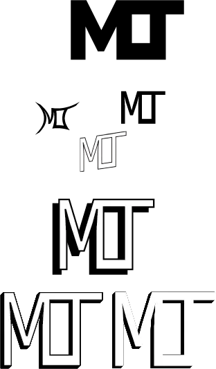
Narrowing the visual language into a clearer and more stable mark while preserving tension between geometry and readability.
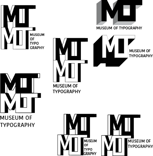
Exploring how the mark could shift, repeat, and fragment across a broader typographic system.
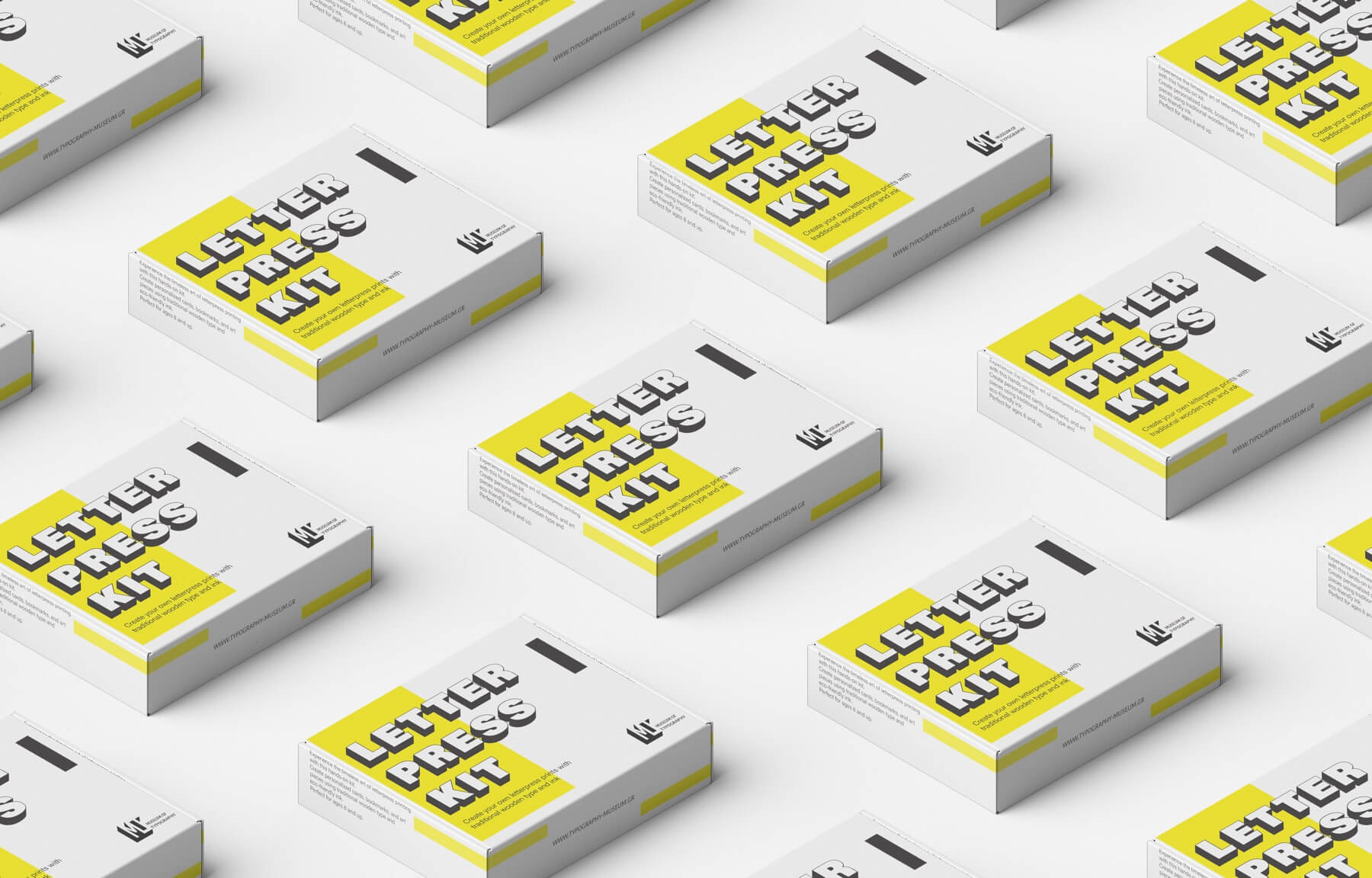
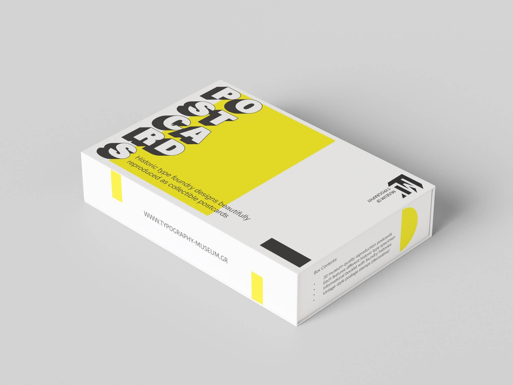
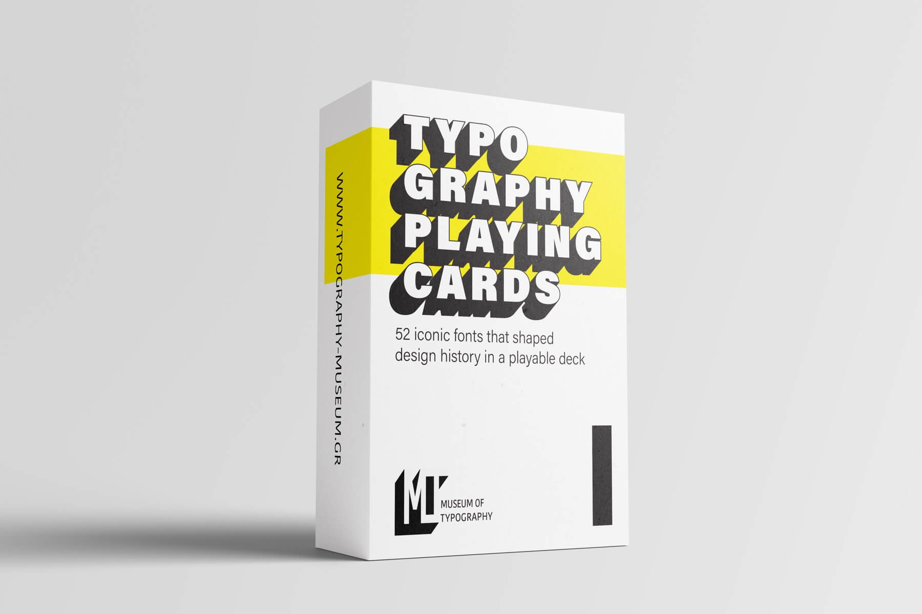
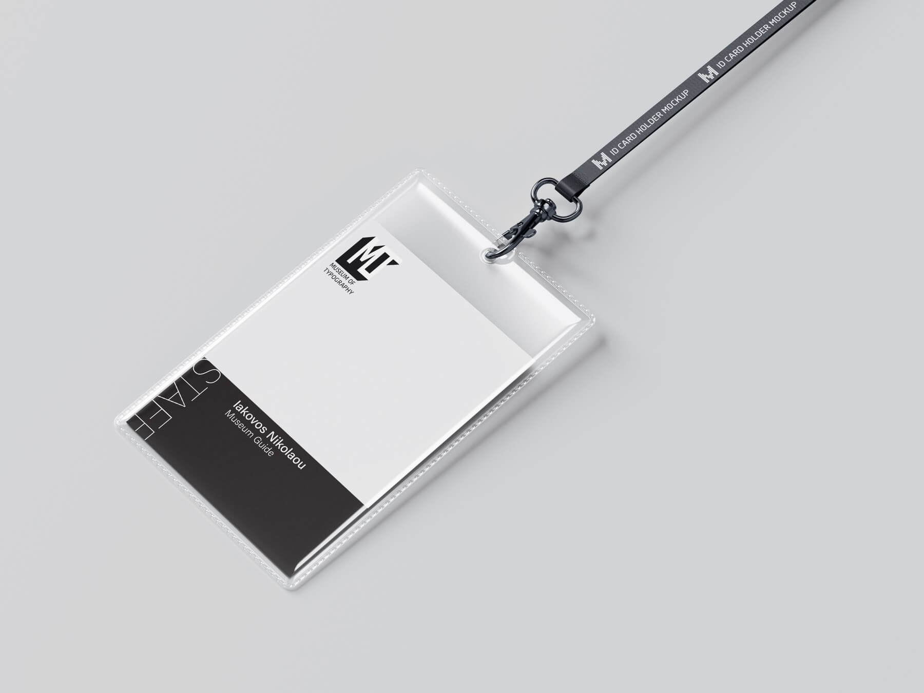
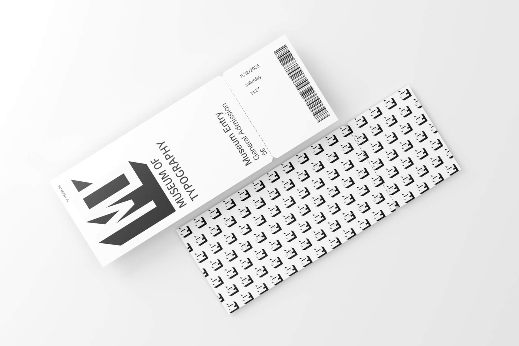
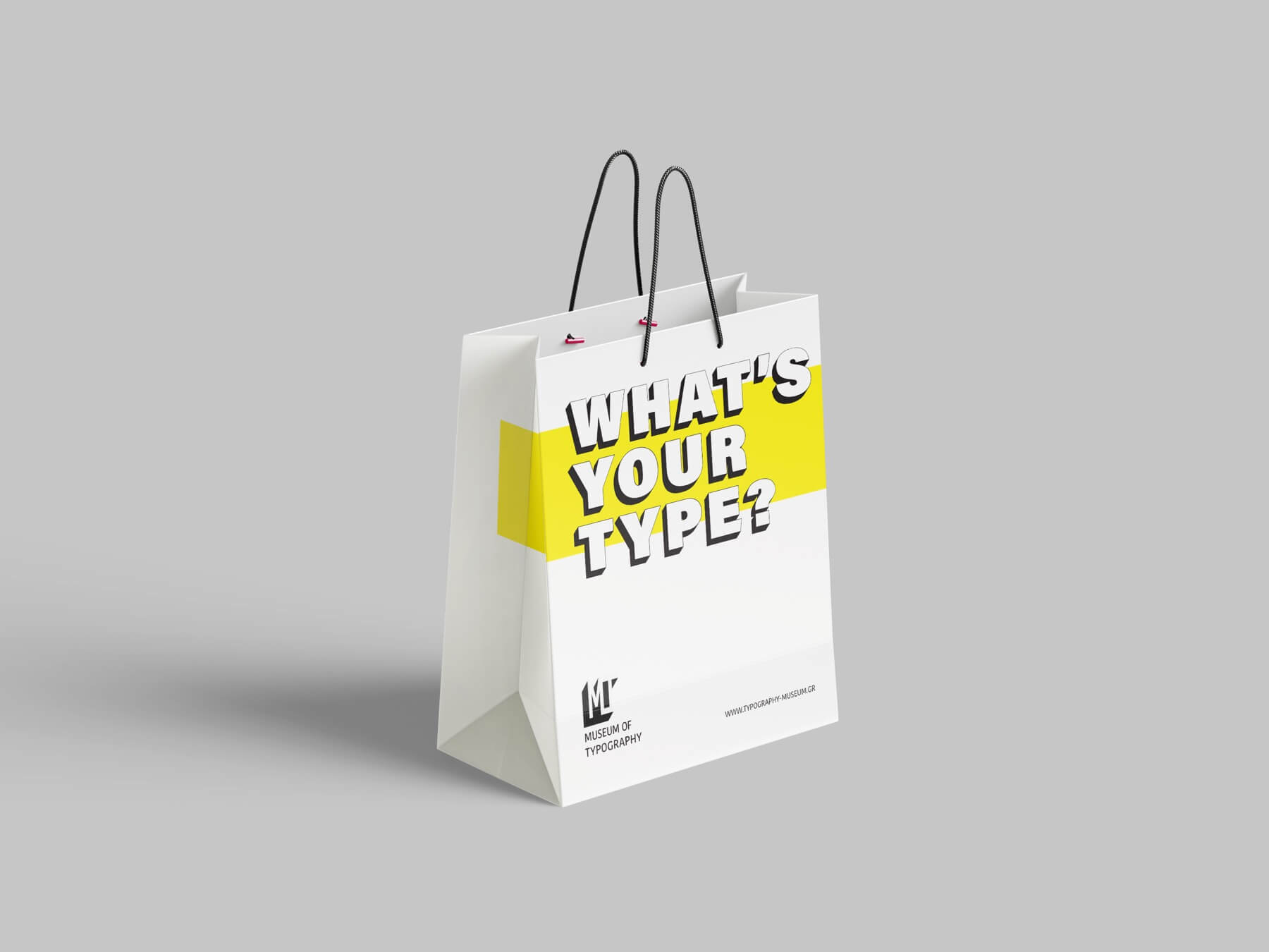
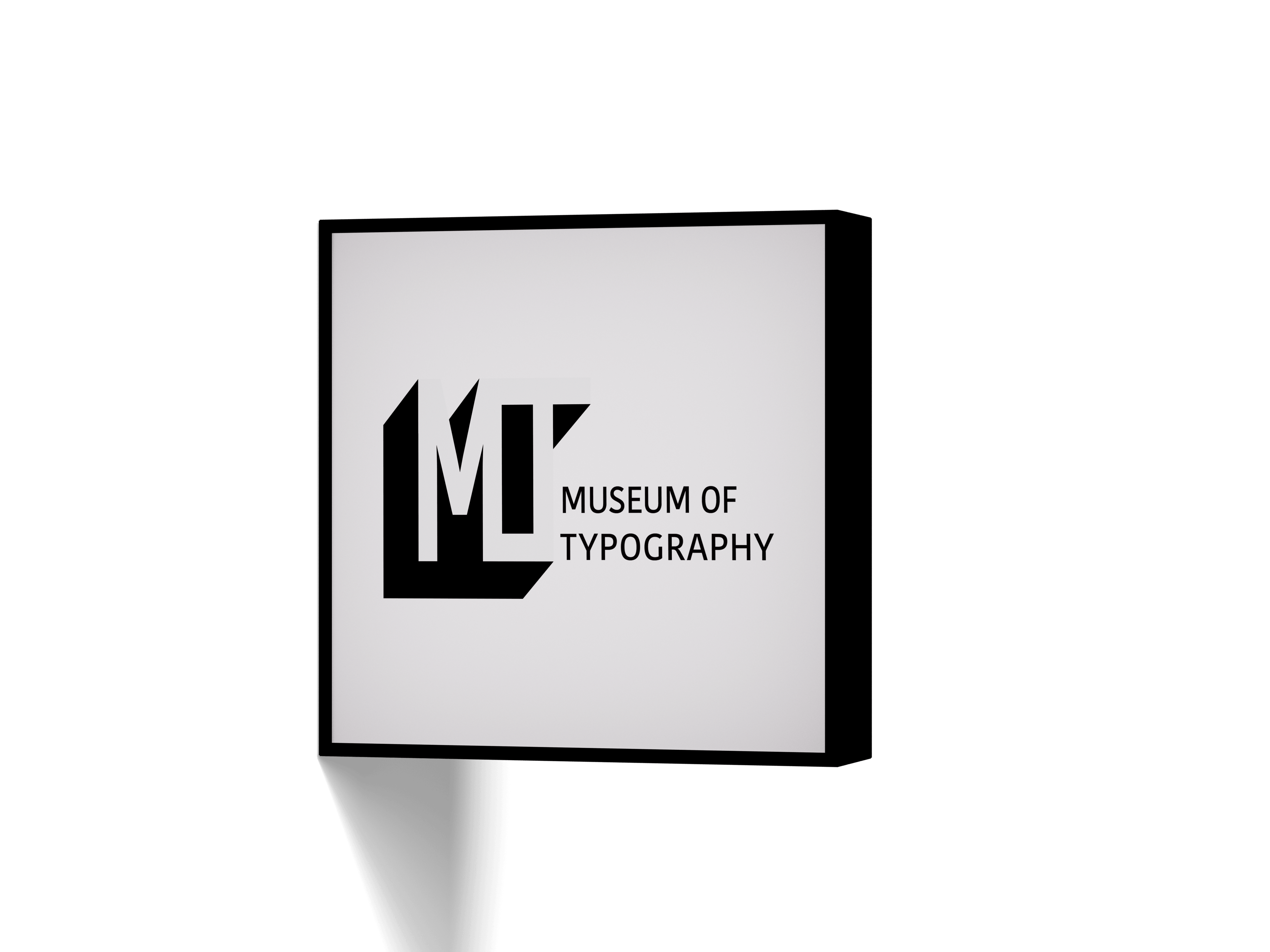
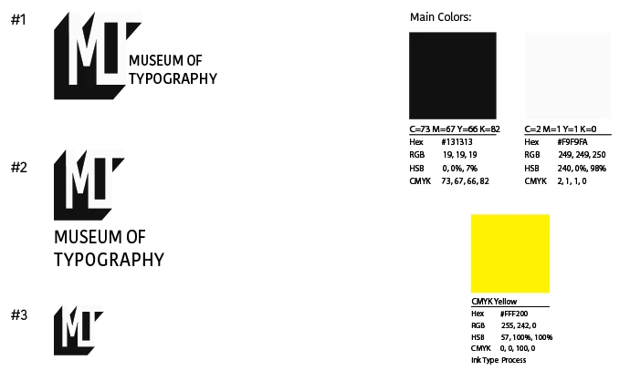
The identity is built as a minimal typographic system, combining structure, repetition, and a reduced color palette.
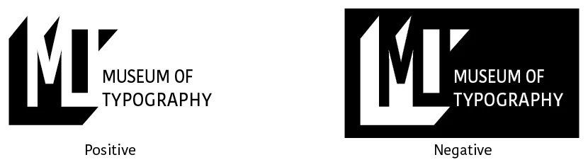
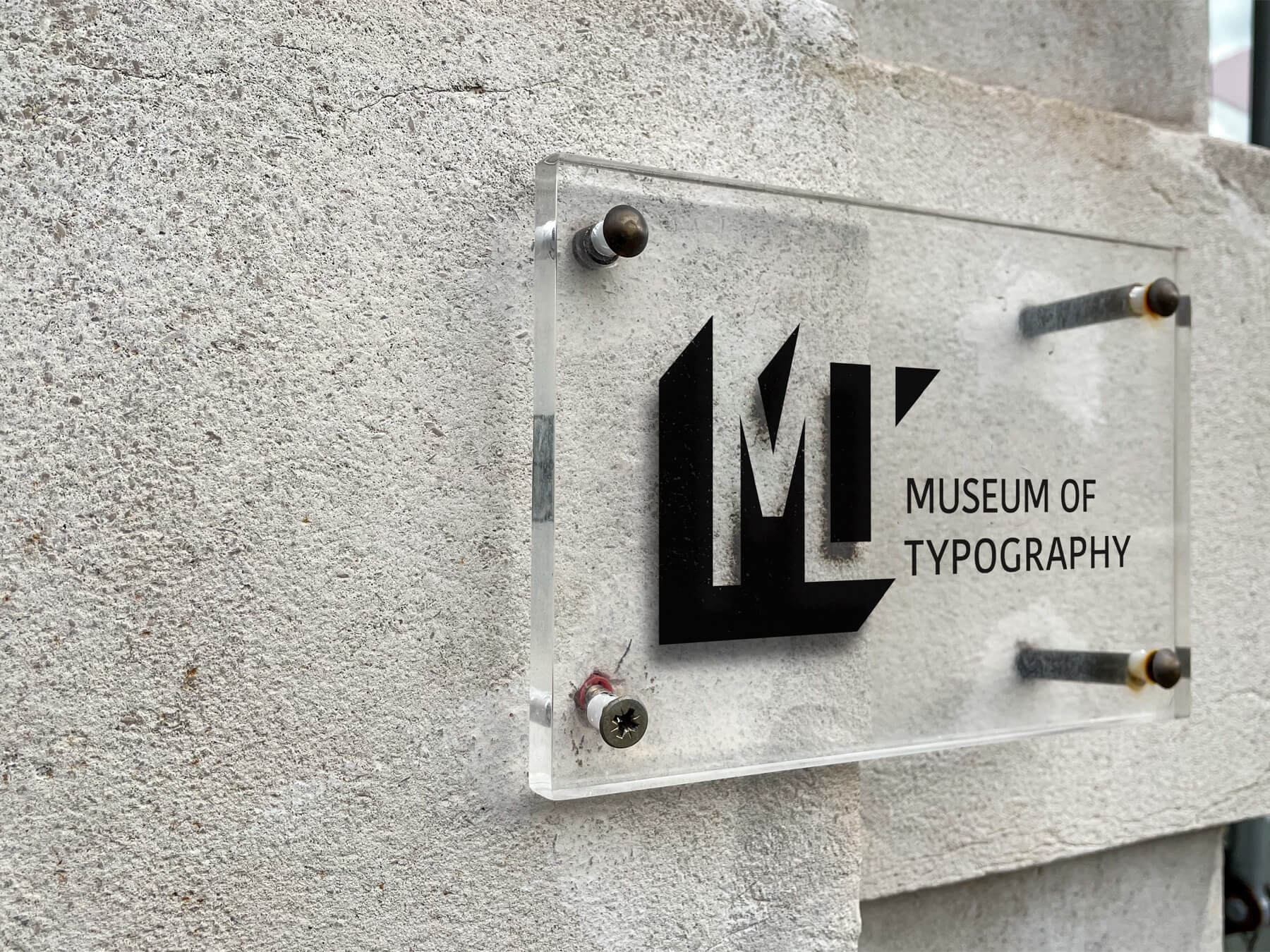
A modular logotype constructed from the relationship between M, O, and T.
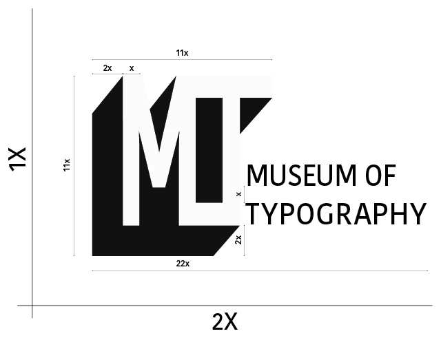
The mark follows a strict spacing system, ensuring consistency across scales and applications.
A reduced palette and modified typeface reinforce clarity while allowing variation.