Kis
Library
Book covers and editorial design for a literary series.
Book Design & Editorial
The brief was to build a brand identity for a new pocket book publisher - one that would make reading feel relevant and appealing to a younger audience that doesn't necessarily see itself as "readers."
The strategic direction was clear from the start: position the book as an accessory, something cool to be seen with, not just something practical to carry. The visual language had to feel young and current without trying too hard.
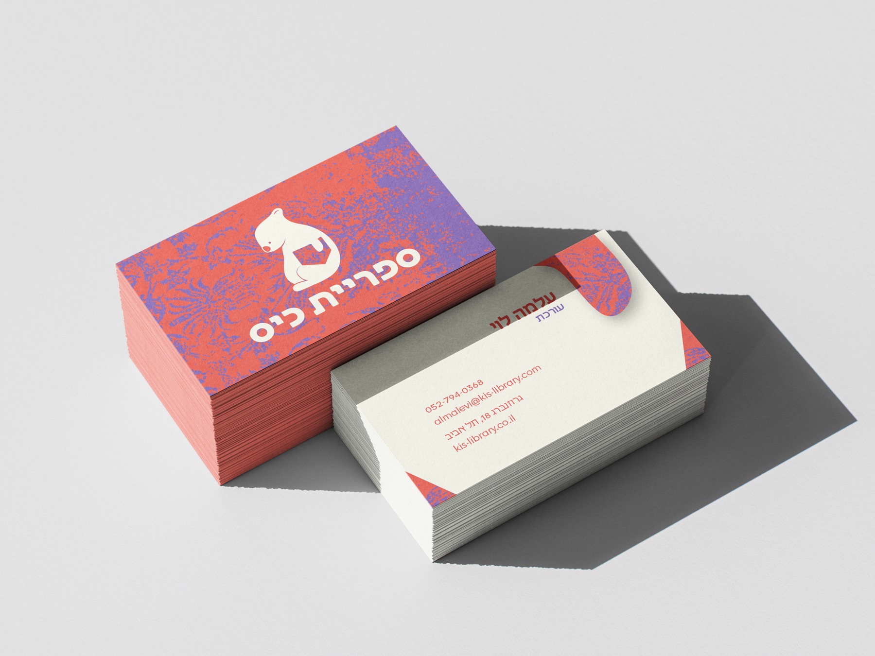
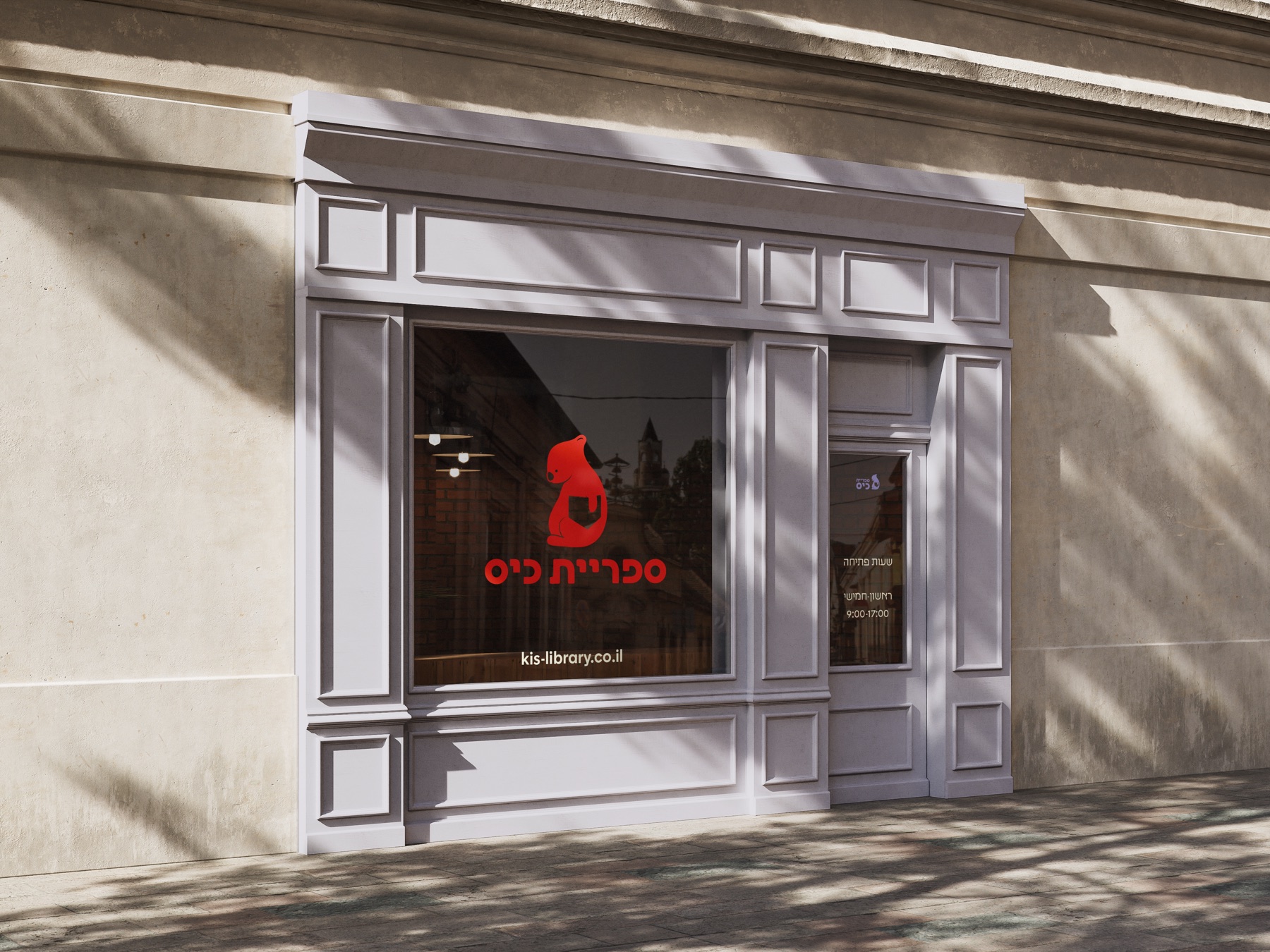
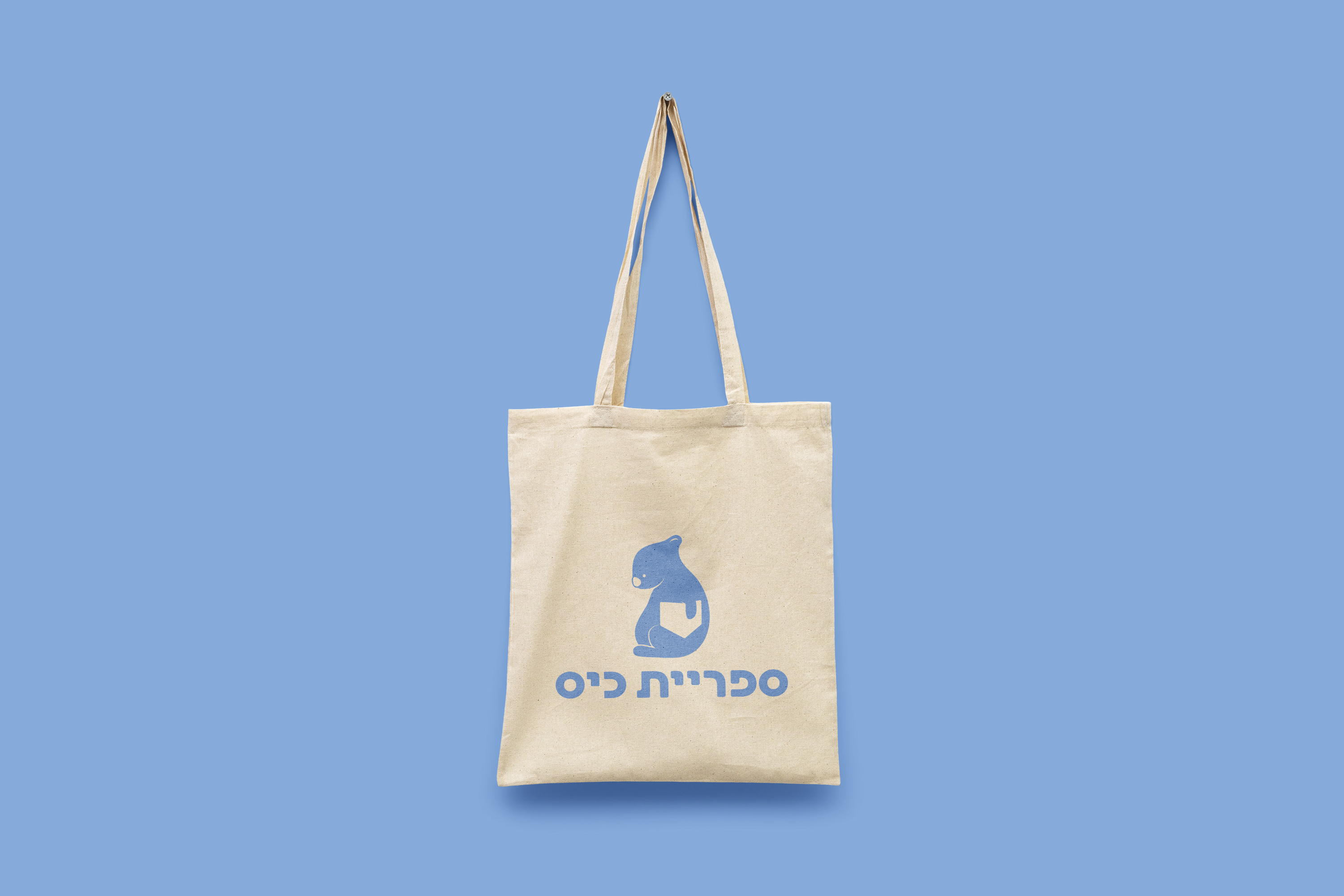
The logo centers on a wombat - a pocket animal, the most literal answer to what the brand is about. The real detail is in the negative space: cut into the wombat's body is the shape of a book sitting in a pocket, visible only once you notice it. A second read that rewards attention without demanding it. The typeface is Modernist Bold, modified - rounded and confident, warm enough to match the illustration without losing authority.
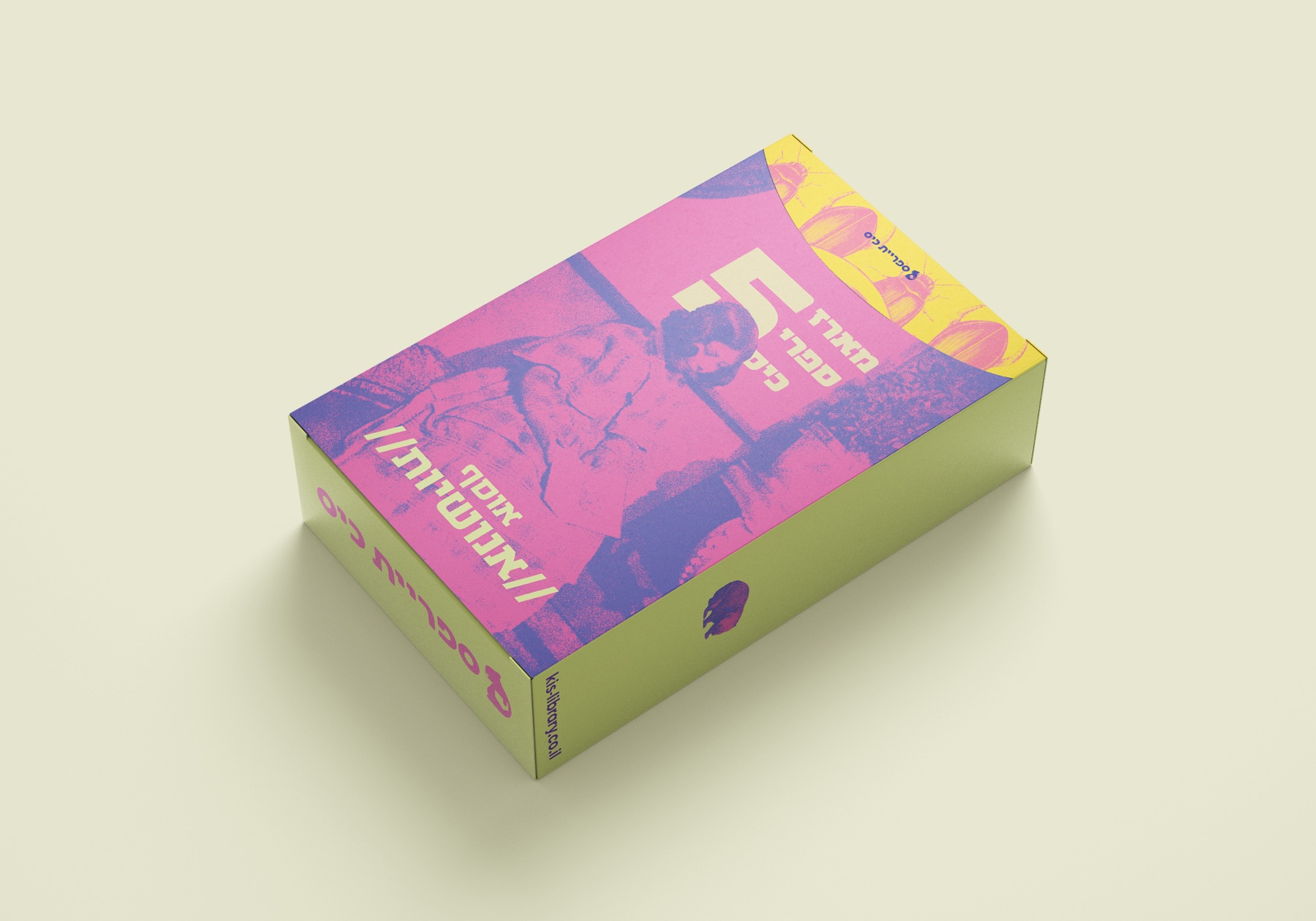
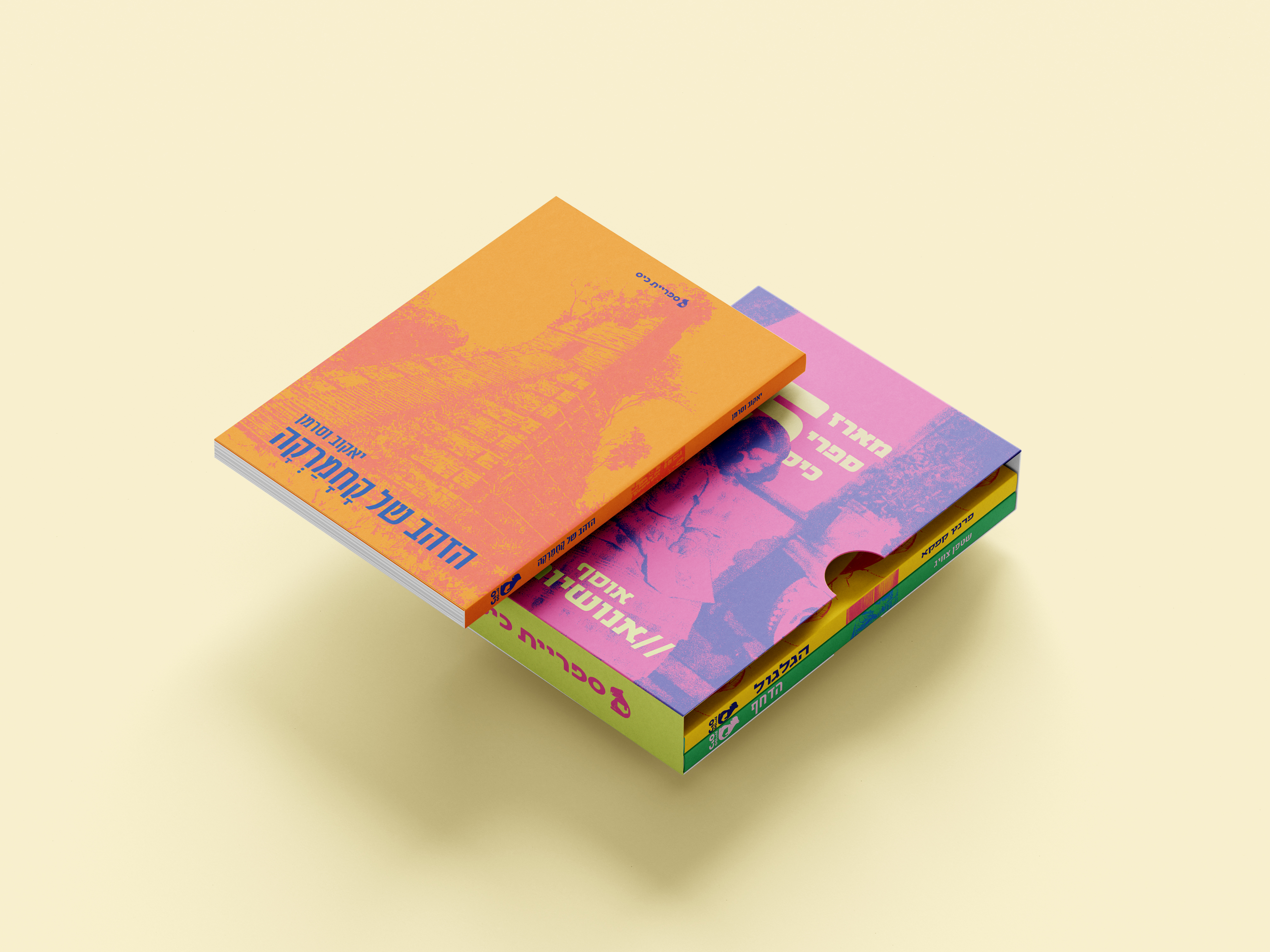
The color palette moves away from the muted tones typical of literary publishing - warm oranges, soft blues, lilac, yellow. Colors that feel more like a lifestyle brand than a bookstore shelf, which is exactly the point.
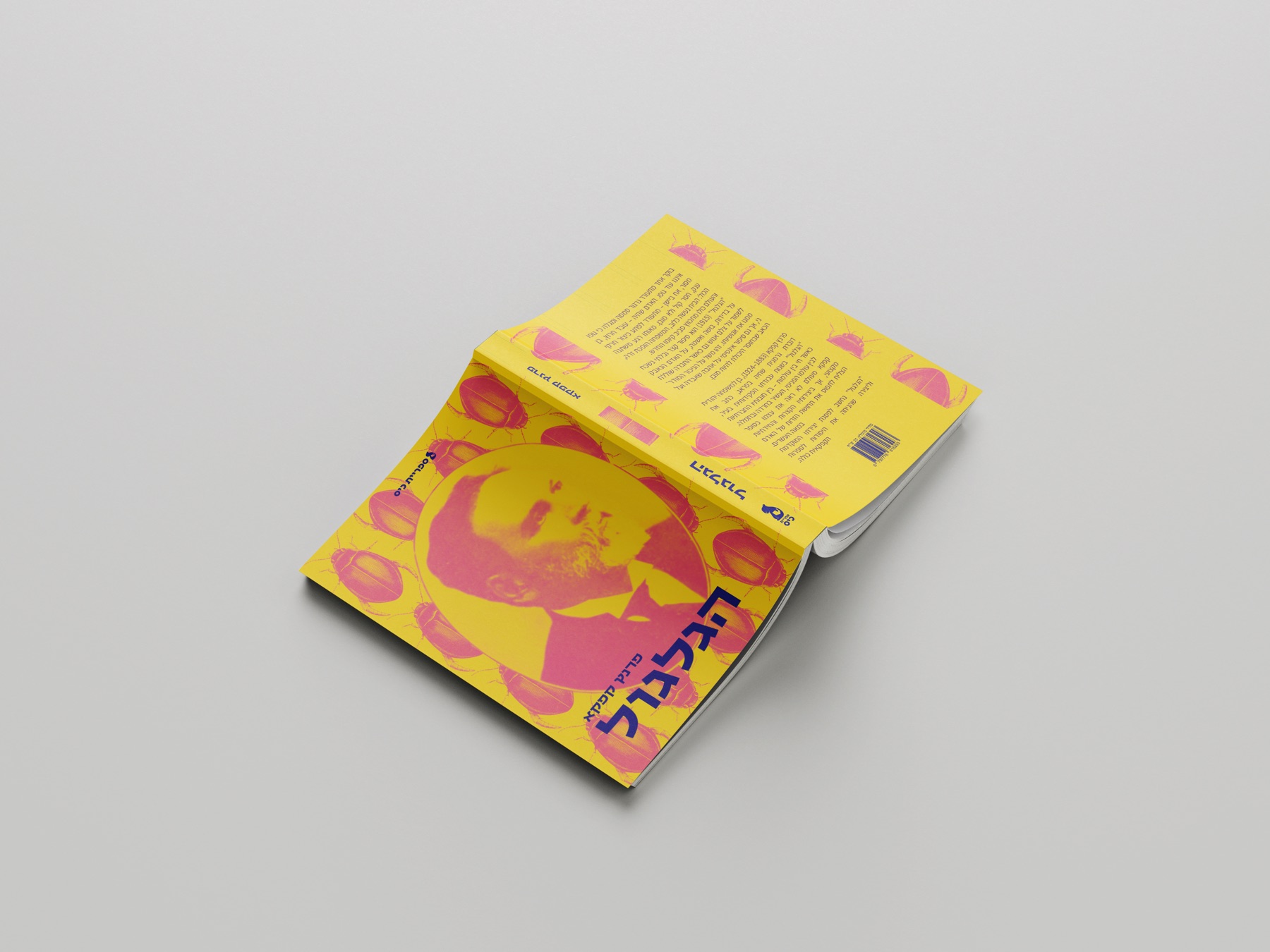
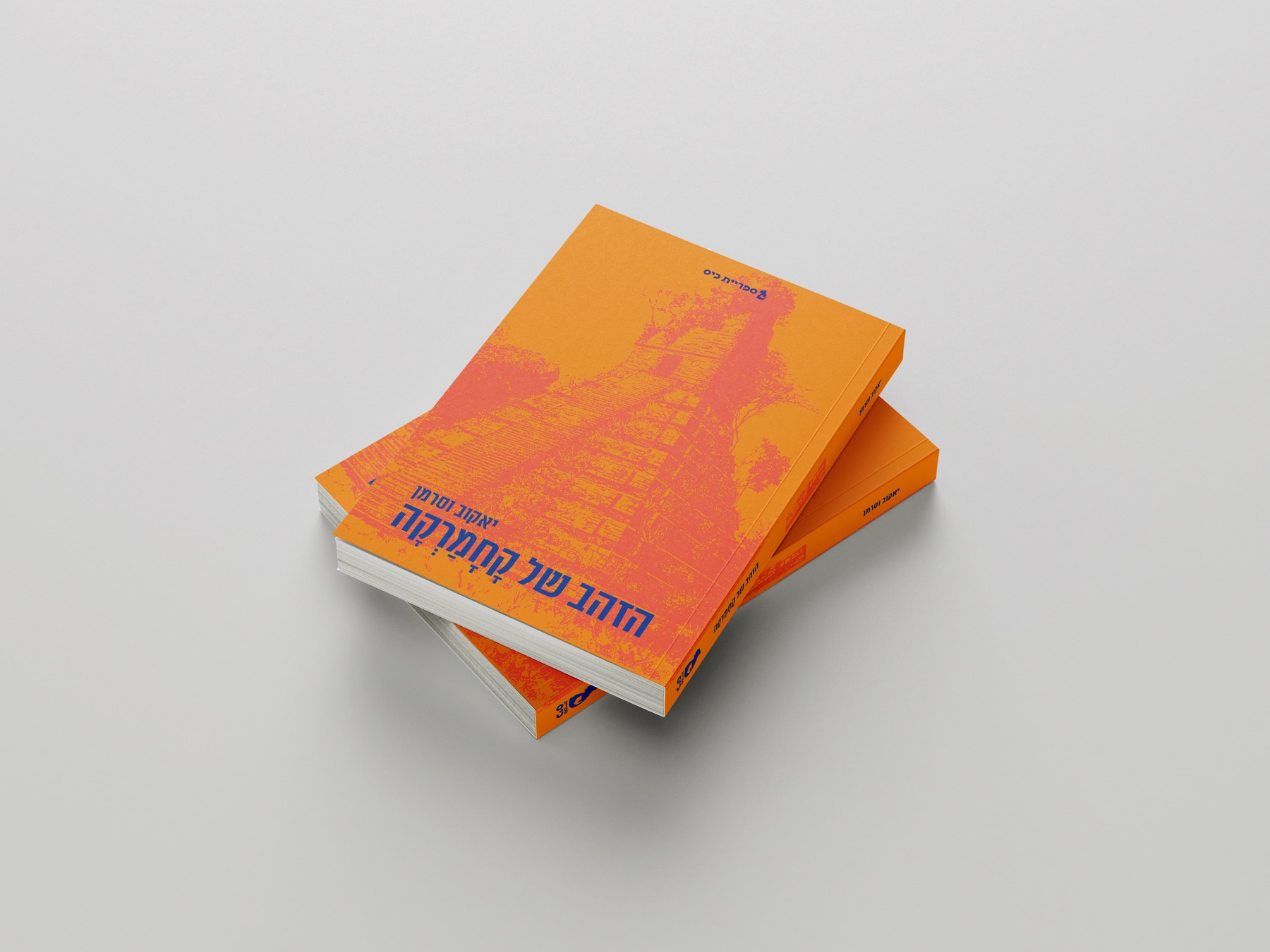
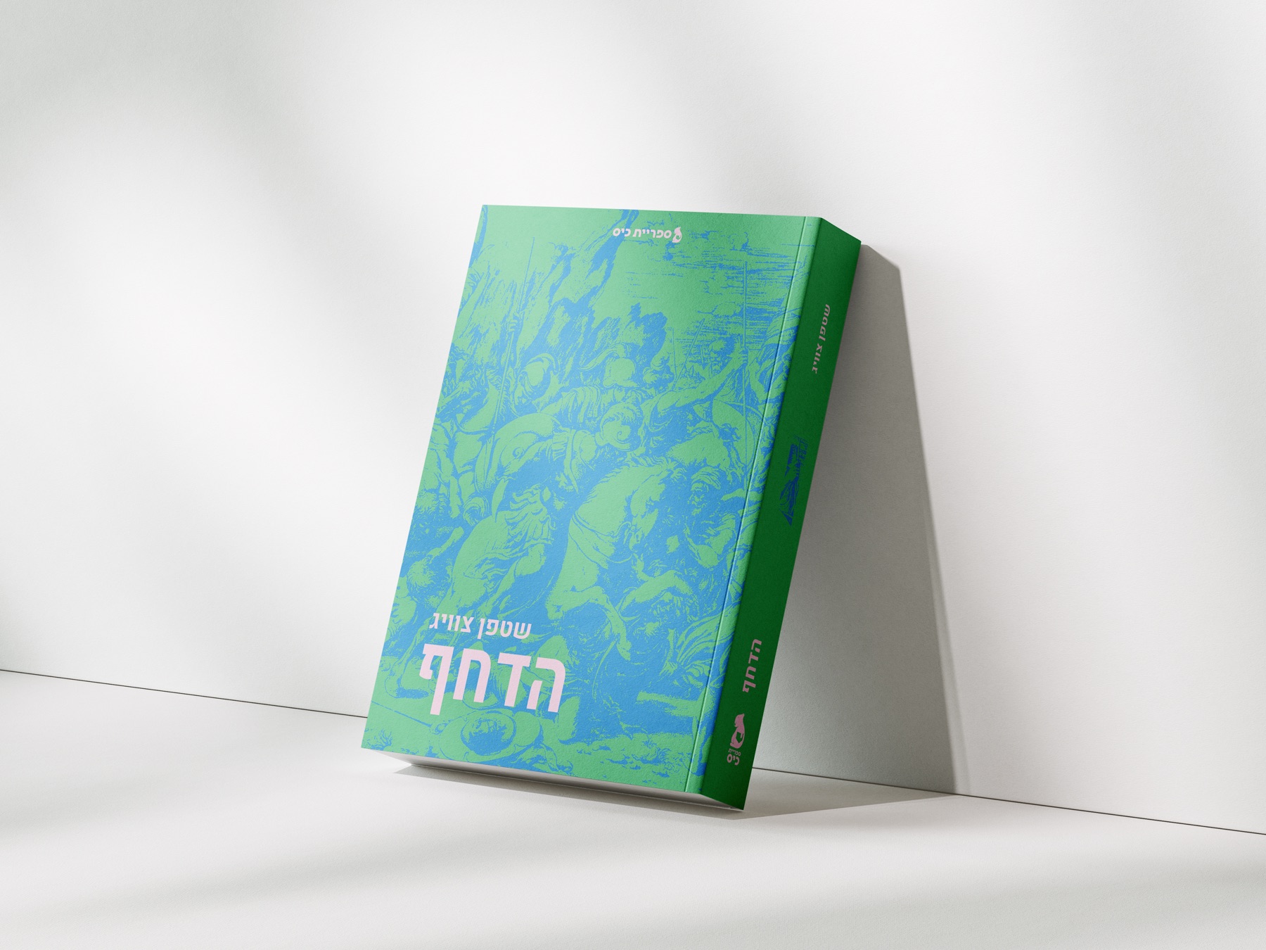
The pocket books are one application of the system - each cover built with archive photography, color chosen to match the mood of that specific title. The brand holds them together while each book keeps its own character.
This is a conceptual project created as part of my design studies.